Effective presentations. How to avoid Death by Powerpoint?

No matter if we are students, educators, entrepreneurs or salesmen, we are all familiar with Powerpoint. During two decades, this piece of software from the Microsoft Office family has been the most used tool to present our academic and commercial ideas.
Nevertheless, our presentations are not always as effective as we expect and sometimes we can even trigger in our audience what is called Death by Powerpoint. What is the source of this problem? Is it always difficult to convey a message to our audience? The answer is simple: We have not a properly designed presentation! We just need to apply some basic rules to improve the effectiveness of our message!
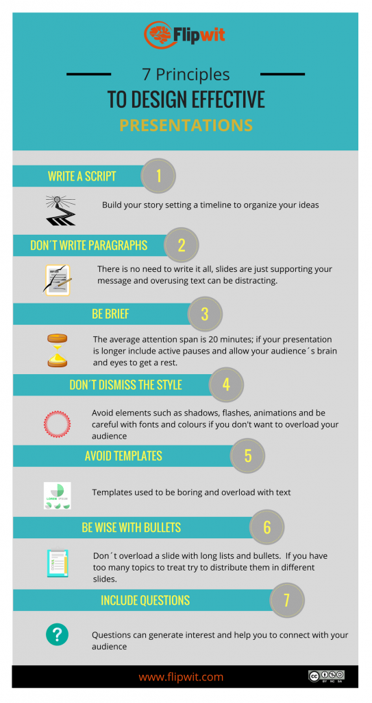
The following are some basic principles to avoid the Dead by Powerpoint.
If you want to boost your presentations, explore all the possibilities with FLIPWIT and try it for FREE

1. Write a script: Planning is important, so before using Powerpoint define the message you want to convey. The human brain is designed to remember stories and no matter, if you are having an academic speech or an elevator pitch; creating a timeline and including the elements of a story, will help us to make it memorable.
2. Don´t write paragraphs: Even if you want to show all your knowledge, slides are schematic tools, not documents. Your audience can either listen or read, so if you want to catch the attention of the participants, you must reduce the text in your slides.
3. Be brief: No matter the length of the session, a presentation must be as short and precise as possible. The average attention span is 20 minutes, and our working memory has a limited size. So, if you want an effective presentation, the less is often more. If 20 minutes is not enough include active pauses and allow your audience´s brain and eyes to get a rest.
4. Don´t dismiss the style: Design is one of the most important elements if you want to catch the attention and be remembered. Using animations, shadows and overloading your presentation with visual elements is a cause of distraction and could make you look unprofessional. Be careful choosing colors and fonts and use images to stand out your message.
5. Avoid templates: After two decades of using Powerpoint, its templates can be boring and overused. Many of those templates are overloaded with text and their choice of colors and fonts are not the most appropiated.
6. Be wise with bullets: Even if your presentation includes many topics, is not convenient to show them all on a single slide. A long list can overwhelm your audience, so you can distribute your bullets and topics in different slides and use images to avoid being boring.
7. Include questions: Questions give you the chance of interacting with your audience and break the monotony. Including questions can also show that you are concern about your audience perspective. On the other side, the intellectual effort of recalling the answer improves the retention of the message that you want to convey.
Comments


